Invitation Cards
Typography Based Invitation Cards
TIMELINE:
3 Weeks
PROJECT TYPE:
Visual Communications Class Project
THE BRIEF:
Using only typographical elements, design 3 invitation cards for 3 different demographics; 6-10 year olds that love animals or dinosaurs, 20-30 year olds that appreciate modern design, and 70-80 year olds that like “the way things used to be.”
card 1:
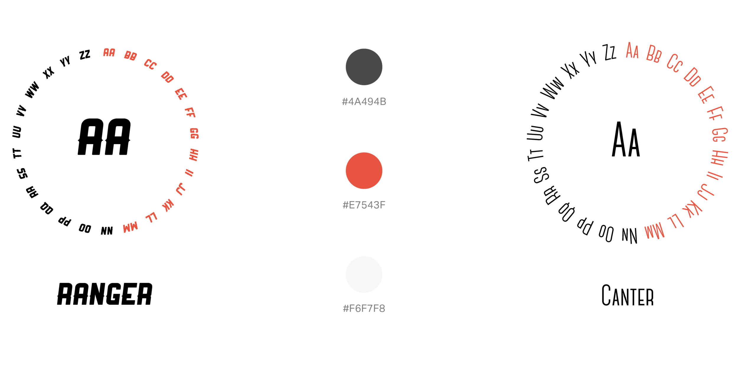
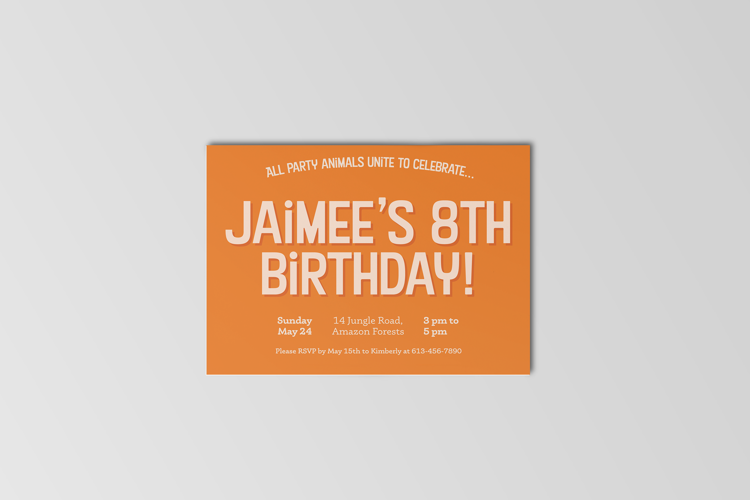
The first card design was targeted towards 6-10 year olds that love animals or dinosaurs. To appeal to the children and capture their attention, I made the main message take up most of the space on the card. I paired this with smaller text in the same typeface in a curved line to break some of the straight-line tension and to add to a more playful elements. The details were placed underneath the main message, and in a different typeface to indicate change of tone and importance.


Card 2:
The second card was targeted towards 20-30 year olds that appreciate modern design. I chose to design a wedding invitation card with a well-known and well-received modern font in different weights, which created delicacy that is associated with weddings. I also chose to use a decorative typeface for the ‘&’ to add some contrast, and hint at the of union between the names.
The two locations and times are separated from each other, but still within the same line to indicate continuity, and have been justified to create harmony and fit within the grid. The date displayed in the center of the card is meant to bring attention to itself since this is important information, and also acts as a connecting element between the different locations and times.


card 3:
The final card was designed for 70-80 year olds that like the way things used to be. Aiming for a retro look-and-feel for the invitation card, I used vintage-style fonts, as well as bold colours to target their image of ‘the way things used to be'. Using a grid, I ensured that all text stayed within the same margins, with the exception of the time of the event that created contrast. I kept everything center-aligned to create harmony and consistency across the card, and ensured that the contrast between the font sizes was just enough to set them apart, but not too much that would take away from balance between the text.